When it comes to creating digital experiences that are both beautiful and brilliantly functional, Oleksandra Mokii doesn’t just lead with style—she leads with strategy. As the Design Director behind high-performing products for global giants like Coca-Cola, Wendy’s, PepsiCo, CBRE, BP, Walmart, and H&M, Oleksandra brings a rare blend of creative vision, technical precision, and user-first thinking.
In this interview, she shares her perspective on what makes great design truly impactful—from building scalable systems and navigating tricky client feedback, to staying human in the age of AI. Whether you’re part of a fast-moving startup or an enterprise team managing complex platforms, her insights are a blueprint for doing design that doesn’t just look good—but works hard.
How do you ensure consistency and quality in design outputs while respecting each client’s unique identity?
It’s like being a great chef—you need a strong base (design systems, frameworks, and processes), but you also have to season each dish uniquely. We maintain consistency through robust design systems, reusable components, and clear guidelines, but we tailor every execution to match a client’s brand, users, and goals. No cookie-cutter designs here—unless we’re talking about well-structured UI components, which, in that case, yes, we have a few perfectly cut cookies.
But great design isn’t just about structure—it’s about empathy. We spend time getting to know each client’s voice and values so that our work feels like an extension of their identity, not a design overlay. That’s how we create products that are not only cohesive and high-quality but also genuinely resonate with their audience.

Can you share an example of introducing a new design process or tool that significantly improved collaboration in a distributed team?
When your team spans multiple continents, real-time collaboration isn’t always realistic—or productive. We realized we needed a process that respected everyone’s time while still driving momentum forward. We introduced async design reviews with structured feedback loops using Figma, Notion, and Loom. Instead of endless Slack threads or timezone nightmares, designers record their thought process, stakeholders leave timestamped comments, and iteration happens without delays. It cut review cycles by 30% and saved everyone’s sanity.
A good user flow is like a good joke—if you have to explain it, it’s not working.
How do you balance your team’s creative freedom with strict client requirements that may conflict with design principles?
It’s a dance. We educate clients on why certain principles matter—because a good design decision is a good business decision. But we also listen. If their requirements seem off, we dig deeper: ‘What problem are we solving?’ Sometimes a minor tweak solves their concern without compromising the experience.
How do you navigate intellectual property and confidentiality challenges in collaborative projects with external partners?
Lawyers and NDAs—because good fences make good neighbors. Beyond legalities, we operate on a need-to-know basis, keep documentation secure, and use anonymized datasets whenever possible. Transparency builds trust, but protecting client IP is non-negotiable.
Our teams follow strict access controls, secure file sharing, and version tracking tools like Figma’s permissions and Notion’s private workspaces. When handling sensitive materials, we apply encryption standards and follow GDPR and CCPA compliance where relevant. The goal is simple: build amazing things together—safely, responsibly, and with full respect for proprietary boundaries.
How do you integrate user research and analytics into your creative process?
Data keeps us honest. We combine qualitative insights (user interviews, testing) with analytics (heatmaps, funnel data) to validate assumptions. The best design isn’t just ‘beautiful’—it’s something we know works. We start by exploring how users think and feel—through interviews, surveys, and usability testing. Then we look at how they actually behave—click paths, drop-off points, time-on-task. This combination helps us identify gaps, validate ideas, and make decisions with confidence. It’s not about guessing—it’s about designing with evidence.
Can you provide an example of pivoting your design strategy mid-project due to sudden client needs or market changes?
A fintech client came in asking for a slick UI revamp. After digging into user behavior, we found their biggest issue wasn’t aesthetics but trust—users abandoned the app due to unclear flows. We pivoted the strategy from pure UI polish to a trust-building UX approach, leading to higher retention. It was a clear case of business goals misaligned with user needs. Once we refocused on clarity and confidence, everything else followed—conversion, engagement, and loyalty.
How do you evaluate and integrate emerging design trends and technologies?
Not all trends are worth chasing. We evaluate trends based on usability, scalability, and impact. If it makes the experience better—not just shinier—we experiment. Otherwise, we let it fade like a bad fashion choice. Before jumping on a trend, we ask: Will this enhance the user journey? Can it scale across platforms and teams? Does it align with the product’s goals? We run small experiments, gather feedback, and measure the impact before rolling anything out widely. Trends should serve the user—not the other way around.
How do you handle client feedback that challenges your design decisions?
We love feedback—except when it’s ‘make it pop more’ with zero context. The key is structured critique. We ask: ‘What’s the business goal behind this change?’ If their feedback is valid, we adapt. If it’s subjective, we educate. Design is a conversation, not a dictatorship.
We also reframe feedback as a shared problem to solve, not a personal critique. Sometimes what sounds like a design request is really a deeper concern—about brand visibility, user confusion, or conversion. Once we uncover that, we can address the root issue with better solutions, not just surface changes.
How have you successfully integrated efforts from design, development, and marketing?
We align early. No more ‘throw designs over the wall’ moments. Devs are in design reviews, designers understand dev constraints, and marketing gets UX insights. The result? A product that’s actually buildable, marketable, and lovable. It starts with shared goals and open communication from day one. We map out dependencies, define success metrics together, and make sure everyone sees the full picture—not just their piece of the puzzle. When each team understands the ‘why’ behind the work, collaboration becomes seamless and the product gets stronger from all sides.
What is your process for creating great user flows?
Start with the problem, not the UI. Research, map user goals, prototype, test, refine, test again. A good flow is like a good joke—if you have to explain it, it’s not working.
We begin by understanding what users are trying to accomplish and what’s getting in their way. From there, we build flows that remove friction, not just add steps. Each screen, action, and decision point has to feel intuitive—like it was designed just for them. If a user has to stop and think too much, we know it’s time to revisit the flow.
The result? Designs that don’t just look good but actually work.
How do you integrate user research and data analytics into your product design process?
We don’t just throw pixels on a screen and hope for the best. First, we play detective—talking to users, running tests, and uncovering what really frustrates them (spoiler: it’s usually unnecessary clicks and bad UX). Then, we bring in the numbers—heatmaps, A/B tests, and analytics—to catch users in the act of struggling. If something’s broken, we fix it. If something’s confusing, we simplify it. The result? Designs that don’t just look good but actually work.
Create high-end software solutions for your company with Intellectsoft
Get in touchIt’s a continuous loop—observe, analyze, iterate. Qualitative insights give us the ‘why,’ and quantitative data shows us the ‘how often’ and ‘where.’ When both sides align, we know we’re on the right track. That’s how we turn user pain points into product strengths.
Can you walk us through your process for iterating on a product design from initial concept to launch, including how you incorporate user feedback?
It’s a loop, not a line. We start with discovery—understanding business goals, users, and constraints. Then, we prototype early and test often. User feedback comes in at multiple stages, and we refine until we have something that’s not just functional but delightful. A design is never truly ‘finished’—just ready for its next evolution.
Our process is structured across eight key phases: Discovery, Define, Ideation, Prototyping, Design Development, Implementation, Testing & Optimization, and Feedback & Iteration. We don’t wait for the end to test—we integrate insights along the way, ensuring the final product is not just usable, but continuously improving to meet real-world needs.
What strategies do you employ to incorporate accessibility and inclusive design principles?
Accessibility isn’t an afterthought—it’s part of our foundation. We follow WCAG guidelines, use contrast-checking tools, test with assistive tech, and, most importantly, consider diverse user needs from day one. Inclusive design isn’t about ‘compliance’; it’s about making products that work for everyone. We integrate accessibility from wireframes to final QA—clear structure, readable text, keyboard-friendly navigation, and inclusive testing. It’s not just about meeting standards; it’s about building for real people in real-world scenarios.
How do you facilitate effective cross-functional collaboration with product managers, engineers, and marketing teams during the design process?
Early alignment is everything. We co-create roadmaps, bring devs into design sprints, and keep marketing in the loop so branding and UX tell the same story. No ‘design in a vacuum’ moments—everyone’s at the table. When teams move in sync from day one, we avoid costly missteps and ship with clarity and confidence.
What role does prototyping and user testing play in your product design cycle, and how do you determine when a design is ready for implementation?
Prototyping is our safety net. We build, test, refine—because fixing issues before development saves time and money. A design is ‘ready’ when it meets user needs, aligns with business goals, and can be built efficiently. We rely on feedback loops throughout the process to catch friction points early and often. And before anything goes into dev, we validate it with real users and stakeholders to make sure it solves the right problem, not just looks polished.
What are the most important design trends to watch in 2025 for businesses?
Trends come and go, but core UX principles never age (shoutout to Nielsen Norman Group for keeping us all sane). While businesses are chasing AI-driven personalization, ethical design, and hyper-adaptive interfaces, the real winners will be the ones sticking to the fundamentals—things like:
- Jakob’s Law: Users spend most of their time on other sites, so they expect your product to work the same way. No need to reinvent the wheel—just make it smoother.
- Fitts’s Law: The easier something is to click, the faster users will interact with it. Yes, that means stop making tiny buttons for crucial actions.
- Hick’s Law: The more choices users have, the longer it takes them to decide. Simplify your UI or risk decision paralysis.
- Flexibility & Efficiency: Your power users want shortcuts, while new users need guidance—good UX serves both.

So yes, AI and automation will shape interfaces, but at the end of the day, the best designs will still be the ones that are clear, fast, and effortless to use. No trend can replace good usability.
How do AI and automation influence UI/UX design?
AI is turning UX into a mind reader—predictive search, hyper-personalized dashboards, and interfaces that adapt before users even realize they need something. But here’s the catch: the more AI takes over, the more we need to keep UX human. Automation should be an assistant, not a dictator. The best AI-driven designs feel effortless, not robotic—because nobody wants to fight with a chatbot just to reset their password. The magic happens when AI enhances usability without erasing empathy—that’s the balance we aim for.
Automation should be an assistant, not a dictator. The best AI-driven designs feel effortless, not robotic.
How does your team handle complex design challenges, such as multi-platform solutions or enterprise-level software?
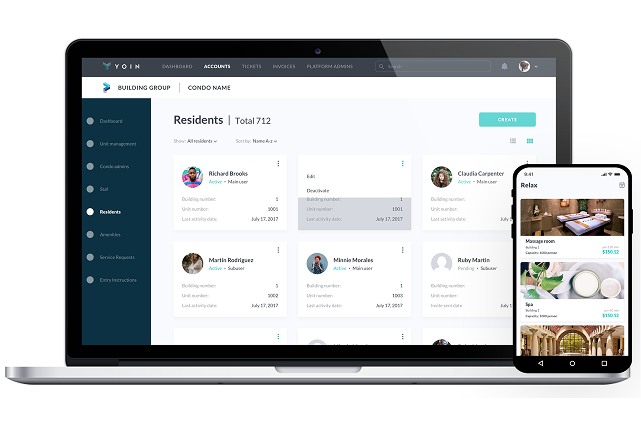
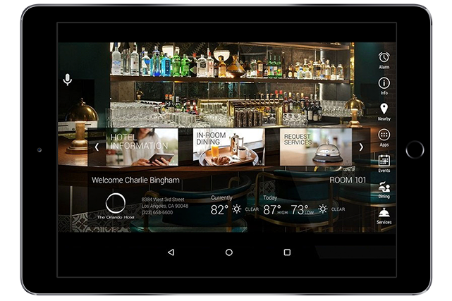
Enterprise design isn’t just making things look good—it’s making them work everywhere, for everyone, without turning into a Frankenstein monster. We start with a strong design system so scaling doesn’t feel like duct-taping features together. Developers are in from day one, because ‘Oh, this won’t work in the real world’ is a phrase we avoid at all costs. Complexity is part of the game, but confusion? That’s what we eliminate—one well-structured interface at a time.
We also plan for flexibility—modular components, platform-specific adjustments, and user flows that adapt without breaking. That way, whether it’s mobile, web, or enterprise dashboard, the experience feels seamless and intentional.
What industries or types of businesses have benefited most from your design solutions? Can you share examples?
Fintech, healthcare, construction, and SaaS are big wins. For example, we helped a fintech app simplify onboarding, cutting drop-off rates by 40%. We redesigned a complex platform for data collection with UX performance improvements of 3.5x (time on task, user satisfaction, etc.), which allowed businesses to save thousands of dollars and grow faster. Sometimes, the best redesign isn’t visual—it’s structural.
How does the Design Lab ensure high-quality results while staying on budget and meeting deadlines?
Clear scope, iterative delivery, and ruthless prioritization. We don’t do ‘big reveals’—we ship in phases, test, and adapt. That keeps quality high without blowing budgets.
What services does the Design Lab offer, and how do they contribute to creating high-performing digital products?
From UX audits to full product strategy, we help businesses build user-friendly, scalable products. Whether refining an MVP or transforming outdated platforms, we make design a growth driver. Our services cover everything from UI/UX design, prototyping, and mobile/web interfaces to branding, testing, and product strategy. We also offer responsive web design, SaaS product design, and usability audits that improve both aesthetics and performance. Whether clients need a one-time design sprint or a dedicated design team, we’re structured to scale with their goals.
What are some of the most common design mistakes businesses make, and how can the Design Lab help prevent them?
The biggest mistake? Treating design as an afterthought. The later design comes in, the more expensive the fixes. A bad UX decision early on can turn into a dev nightmare (and a budget killer) down the road. We help businesses get it right from the start—so they spend less fixing and more growing.
Another common pitfall? Designing for stakeholders instead of users. We shift the focus back to real people—validating ideas through research, testing, and data. Our approach ensures the product is not only visually polished, but truly functional and aligned with business goals from day one.
What advice would you give to businesses looking to elevate their design but unsure where to start?
Don’t wait until your product is a hot mess to think about design. Fixing bad UX later is like renovating a house after you’ve moved in—expensive, messy, and full of regret. Start by understanding your users. Then, fix the biggest pain points first—don’t try to overhaul everything at once. And if you’re stuck? That’s what we’re here for. Good design isn’t about doing everything at once—it’s about making the right moves at the right time to create lasting impact.


Subscribe to updates
Source link